
How to Pick the Perfect Color for Your House (Without Regretting It Later)
- Todd Tilford
- Jul 10
- 3 min read
Choosing a color for your home—whether it's the exterior or interior—might sound easy… until you're staring at hundreds of swatches with names like “Coastal Fog” and “Evening Hush.” At CAD Design Systems, we've worked on hundreds of renovations and new builds, and we’ve seen first-hand how the right color choice can make a home feel inviting, polished, and uniquely you.
Here’s a practical guide to help you pick the perfect color for your house—with confidence.

Start with Your Surroundings
Look at what’s around you:
Location matters. A beachfront home in Cocoa Beach calls for light, airy tones—like soft blues, off-whites, or sandy taupe's. A house in the woods or suburbs might lend itself better to warm grays, olive greens, or deeper neutrals.
Neighborhood context. You don’t want to match your neighbor’s exact paint job, but you also don’t want to stick out for the wrong reasons. Stay within a complementary range.
Pro Tip: Drive around your area and snap photos of houses you love. You’ll start to notice patterns in your preferences.

Think in Three Tones
When painting your home, use this simple 3-color rule:
Main Color – for the siding or main wall surfaces
Trim Color – for fascia, window frames, and edges
Accent Color – for the front door, shutters, or special features
This combo creates visual depth and polish—just make sure they work together in the same warm or cool family.
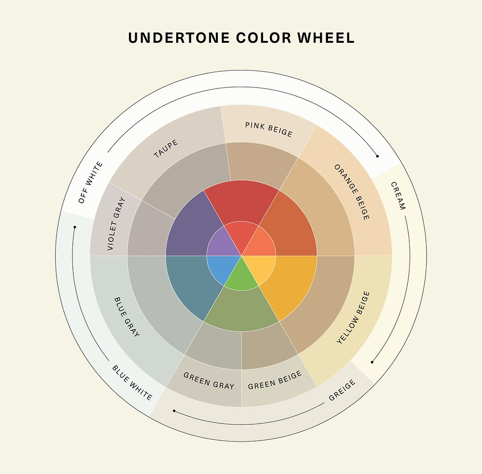
Understand Undertones
Two colors might look similar in the store, but one has a yellow undertone, while the other leans blue. These undertones can totally shift how a color looks once it's on a wall or under sunlight.
Interior lighting (warm vs. cool bulbs) and natural daylight will influence how the color reads throughout the day.
Test Before You Commit
Never pick a color based solely on a tiny swatch! Instead:
Buy sample paints of your top 2–3 choices.
Paint a 2x2 ft. section on the wall (both sun and shade sides for exteriors, or different rooms for interiors).
Observe them in morning, afternoon, and evening light.
What looks amazing at noon might look gray or flat at dusk.

Match Color to the Mood
Color sets the vibe:
Soft neutrals feel timeless and clean
Warm tones make spaces feel cozy and inviting
Cool tones feel calm and fresh
Bold colors (like deep navy or charcoal) make great accents or statement walls
Think about how you want your home to feel—and let that guide your palette.
Coordinate with Materials
Don’t forget to account for:
Roof color
Stone, brick, or siding
Pavers, walkways, or landscaping
Your paint should complement—not clash with—your existing permanent materials.
Here are some apps you can use to help you find that perfect color.
1. Sherwin-Williams Color Snap Visualizer
Pros: Easy to use, extensive color library, and the ability to see how colors look on a photo of your home.
Cons: Requires a good quality photo for the best results, and some users might find the interface a bit overwhelming at first.
2. Home Depot Project Color
Pros: Integrates with Home Depot's product line, making it easy to find and purchase paint. It's user-friendly and allows for quick color comparisons.
Cons: The color matching might not be 100% accurate, and it may have fewer features compared to some other apps.
3. Benjamin Moore Color Portfolio
Pros: Includes a unique feature called the Color Reader, which helps match real-world colors. It also has a wide range of colors and is easy to navigate.
Cons: Works best with Benjamin Moore paints, so if you're using a different brand, you might need to do some extra color matching.
Choosing your house color is a mix of art, science, and personal style. Take your time, trust your instincts, and when in doubt—go classic. And remember: paint is one of the most powerful (and cost-effective) ways to transform a home.


Comments